Tuesday 27 December 2016

Case Study II, Landsknechts / Swiss in French Service


Over the past few months I have been working upon some Landsknechts or rather Lansquenets in French service.

Each time I work upon a unit of Landsknechts I learn something new or apply a different approach and this is no exception. Last time I got to grips with Pinterest which really helped for colour combinations both from contemporary sources and re-enactors which you can see on these two boards that I have put together;


In tackling this unit the challenge was to make the figures to be clearly in French service and in some way subtly different from their Imperial counterparts. I approached this with the use of white cross and fleur de lys field signs and the banners to emphasise a sense of unit identity.

I paint all of the standing Landsknechts in my collection with field signs and appropriate banners and leave those in advancing poses and arquebusiers neutral so that they can be easily interchanged.


With Landsknechts colour is key but this is by no means a straightforward task if you want to achieve convincing results. If you're new to this blog have a read through the pages for my experience and advice upon how to paint these figures.

On to the figures, first up are the standard bearers or Fahnriche


This Landsknecht carries a simple banner of the cross of St Denis on a striped yellow and red background to reflect Louis XII's livery. He wears a Wappenrock (war coat) for which I was keen to apply some inspiration found in a series of coloured paintings that heavily feature the garment. Here's some examples and there are more on the Pinterest link above from which you can also view the original source;


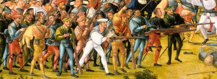
This half plain / striped design is also apparent in the French / Italian cavalry in lower right of this depiction of the Battle of Marignano, I'll repeat this when I next work upon some cavalry.


The second banner bearer is a heavily armed infantryman in yellow clothing to match the banner and a cross of St. Denis painted on his breastplate. When painting I use a dull brown wash after the base colour to achieve a slightly earthy tone, I vary this for some colours in an attempt to really bring them out; for yellow I use a 50/50 dark leather / dull brown wash which I find works as a good base for ochre. For Red I add tan and dark red to the wash and for blue I wash with a mix of dark blue, black and dark brown. On the first standard bearer I waited for the blue wash to dry before doing the brown wash for the rest of the figure to avoid the washes bleeding.

Third and fourth standard bearers; the banner on the red background tends to be used as a bit of a generic catch all for French troops in quite a lot of sources so I was a bit reluctant to use it at first however I considered the unit would look a bit more balanced with a plain and striped banner - the dilemmas of composition !

I took inspiration from the Pavia Tapestry for the banners which itself is well worth a close study. The tapestry or rather series of tapestries were completed by Bernard van Orley in Brussels during 1528-31, from the series a number of French banners within the infantry can be easily identified and follow a theme of either a plain cross of St Denis on a yellow, blue or red background or upon a striped background as can be seen here;


This theme with some variation is typical of the first quarter of the sixteenth century as you can see between the Marignano (1515) & Pavia (1525) images above.

The banners were created as black and white drawings using Photoshop and printed onto self adhesive paper. I painted them in the usual 3 stage method then cut out and carefully folded with highlights painted onto the creases thereafter.

The pennons were a great find from the Front Rank 18th Century equipment range, a Fleur de lys with tassels and cravat really help to emphasise unit identity and seemed suitably date neutral to use for this period;


The remainder of the command group for the first base are the lieutenant and two doppelsoldners with zweihander and halberd;

The lieutenant wears a parti-colour coat as described above with a fine red hat and shoes, I also painted a small cross brooch on the underside of his hat.

Aside him his guards are a well armoured halberdier and a rather impregnable looking chap in half armour wielding a formidable two handed sword. The latter figure features in Steel Fist Miniatures range of 16th century dismounted knights, they're very clean casts and the sculptor has been at considerable pains to ensure the accuracy of source material. They also blend rather well with this range of Foundry Miniatures.


For the second base we have a fifer, commander and another doppelsoldner with a formidable zweihander.

On to the men in the ranks;


Most of these were inspired by the aforementioned Pinterest galleries with a couple of my own combinations thrown in. You can batch paint and mix if you're doing a lot but I've always done them as individuals and checked what colours I've used before embarking on a new figure.

In addition it's good to have a couple in fairly basic colours then a mid range and then a couple in a riot of colour, remember that some may be obscured by the flags so have a few trial runs at how you want to base the unit.


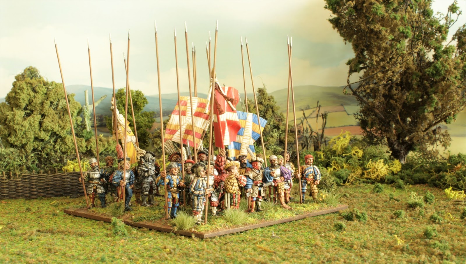
On that subject as I've based these on a single 120x60mm base it's quite tricky to apply the basing process, particularly the filler when you start. You can either apply the figures to the base in stages or just be patient with the filler, I use both a standard and very narrow palette knife to help with this. I also blend filler with acrylic paint mixed to the same colour as the basing paint, that way if the base gets chipped it doesn't stand out as much as plain white filler.


There's no such thing as too many Landsknechts !

Bye for now

Stuart

Saturday 9 February 2013

Introduction


The prospect of painting Landsknechts (or Swiss for that matter) can be daunting; with so much colour, flamboyance and variety of dress they are unlike any other infantry of their age, if you’re painting these for the first time it can be difficult to know where to start.

However, I am confident that with a little research and some adaptation to your approach you will soon embrace these differences and really get into them in a big way. I have painted Landsknechts for many years now and find myself returning to them time and again. Whether you are venturing out on your first fahnlein or in need of some inspiration to return to an unfinished unit I think you’ll find this painting guide of use.


Painting Landsknechts will be a real test of your ability but with a few of the hints and tips that I shall describe here I truly feel that you will be able to paint these figures with relative ease and enjoyment plus develop and improve your skills as a result.

The miniatures I have used in this guide are from Wargames Foundry’s Renaissance range. I also use their brushes and, in particular, their paint system; this is specifically designed to work in up to three stages from dark to light and suits my painting style exactly. This is not an intentional advertisement for Foundry, merely the use of figures and materials which I find work well for me.


I have constructed this blog to be used as a painting guide; each topic has been broken down into 'pages' which you can select from the labels menu on the right.

In effect, this is not so much a blog but more of a painting guide or tool to use as you need it for whatever stage of your Landsknecht painting projects.


The narrative and idea for this blog was put together with much help and encouragement from the late Richard Knapton of the Renaissance Wargaming Society to whom I also dedicate my ongoing efforts.

I hope this guide is useful to you.

Stuart Mulligan

Selecting a Palette


As with any historical period I believe that you really will get a much better feel and understanding for these troops if you do some research first.Take some time to look at contemporary paintings and woodcuts of the period to get a feel for the way the clothing was made along with the dyes available at the time.

To begin, I thoroughly recommend you look up the coloured woodcuts from the workshops of Albrecht Altdorfer and Erhard Schon, the level of detail is astounding and it will give you simple starting points such as the colour and decoration of hats and feathers, typical colour combinations and most importantly an appreciation for the dyes and hues of colour available. For example, Yellow tends to be a more earthy ochre, white a lived in canvas and deep reds with brown and orange variations.


My basic palette is as follows, each number represents a 3 pot colour set from the WF range;   

Clothing;

Orange 3   - Good to have, I use the shade colour as a final highlight to Scarlet.

Yellow; I begin with a base of Deep Brown Leather C which is washed with a mix of Deep Brown leather A and Bay Brown A. I then re-touch in Deep Brown Leather C then Ochre 4A & 4B as a final highlight. I find this much better than the standard yellow palettes, it's a lot more natural and consistent with contemporary paintings. 

Canvas 8 - a good alternative to white and also looks good to represent the inner lining of clothing and also feathers.

Royal Purple 19   - Rarely used but it beats mixing it.

Blue; I use Deep blue B with a wash of Deep Blue A and a tiny amount of black, I then re-touch in Deep Blue B through to Deep Blue C with Sky Blue B as a final highlight

Phlegm Green 28  - as with ochre it's quite a muted green and is not as stark as others.

Black; I use the Granite 31 set with a black wash.

Scarlet 38  - A decent well rounded red. I also use this as part of a flesh wash.   

Everything else;

Spearshaft 13 - pike / halberd shafts & katzbalger handles.

Bay Brown 42 - Used in flesh & shading washes.

Deep Brown Leather 45  - Used for leather, also used as a shade wash for Ochre.

Chestnut 53, Drab 12 & Tan 14   - Hair, shoes, coifs, caps, sword scabbards.

Flesh 5 - Flesh.

Gold 36   - Buckles, armour trim & sword decoration.

Armour 35 - armour plate, chainmail and trim.

Note; These are a starting point as I use a wash over all of the shade colours then build it up from there. This gives the figures a lived-in look and achieves a more earthy tone which I favour. I detail this procedure in the step by step pages.


Perhaps the most important aspect one can gain from a study of contemporary images have is that complex stripes and a riot of slashing and colour are not a feature of every Landsknecht, the opposite tends to be true – the more elaborate a soldier’s dress appears the more likely they are to be paid more, as the collection of Erhard Schon woodcuts at the top of this page illustrates in the depiction of a drummer, halberdier, arquebusier, light cavalryman and officer. All of these were usually experienced soldiers and were paid at least double, if you reflect this in your painting these troops will stand out as different – just as they’re meant to be.

Most rank and file soldiers are usually depicted in fairly simple combinations of colour, with one colour predominant or a simple two tone variation. 

To complement these simple palettes you could then add further detail in a different colour to the hats, ribbons and inner slashing.

You can then start to experiment with stripes on a leg, arm, one side of the body or the entire figure.

Another fun study is to try emulating a woodcut which can be quite fun though it is rare to find a figure sculpted as a facsimile of a woodcut, there's more on this in the Erhard Schon Case Study post.

Generally certain colour combinations tend to recur, the chart below reflects this and will help you to paint your units, whether just using one or two tones to many;


REDGreenYellowBlueGrayBlackWhite
YELLOWRedGreenBlueWhitePurple
WHITERedYellowBlackBlueGreen
BLUERedWhiteYellowGrey
GREENWhiteRedYellowOrange Blue
PURPLEWhiteYellowRed
BLACKYellowRedWhite
GREYWhiteRed
ORANGEGreenWhite

Begin by selecting a colour from the first column, this will become the anchor, a colour which will be predominant and represented on at least two limbs or one limb and the torso. Now pick a colour from the additional columns to complement it, whether as stripes, ribbons or lining as shown below;


As these examples show, less really is more ! You can stop there and leave it at that, in fact make sure you do so for a few of your men.

If you want to add further colour the remaining colours listed in the columns to the right of your primary colour will work well against what you have already selected;


Using this method here's how I painted the figures above; I started painting the fifer with blue as the anchor and then painted the right leg yellow and the left green and red - all of these colours complement each other independently and as a whole.

For the halberdier, again I began with blue as the anchor although to a lesser extent as one arm is striped, the remaining colours all complement each other as above.

Once you've had some experience and gained confidence with your basic palette you could then introduce muted shades of your base colours and apply the same principles as above. So replace white with an off white or light brown, try a blue grey instead of blue or go the other way and opt for a lighter blue.

For red and yellow try tans and ochres. When you're starting just try your new colour on a limb and if you like it you could do a whole outfit. The more variety you try the more 'Landsknecht' your miniatures will look.


Details Details Details


As well as their flamboyant dress it's the little details that can really add the finishing touches to your figures.

1. Short sword (Katzbalger); take the time to paint the handle as metal and it will help to bring some focus to this key aspect of Landsknecht identity. You could also paint the top of the handle and alternate quillons (the 'S' bit) in gold. I usually paint the scabbard black and highlight at the edges to try and represent the dimple that the fuller of the blade would leave.


green slashed schlappe 1515-1525

2. Arming coif, also known as a 'schlappe', I tend to paint these in a variety of browns or off whites to represent the leather or canvas materials that these tended to be made of. Some coloured woodcuts also show these as red or green as in the example above.


3. Hats; These are depicted in a variety of colours and are occasionally patterned. Don't get too tempted to paint the hat strap in the same colour as the hat, try red, blue or green and it will add an extra element to your figure.

4. Coat linings; sometimes you can see an open tunic or jacket. These were invariably lined with a canvas / calico type material so paint it an off white or cream.

5. Sword belts; sometimes these were leather but often they were tied silk in a variety of colours.

6. Stripes; these were very common and they can be intimidating if you're a newcomer to them, paint them in the flow of the fabric and stance of the figure, also, as with the left leg of the arquebusier below, don't be tempted to have a stripe follow a sculpted slash as it can lead to them being uneven. Paint them evenly on the figure as you find it unless it is easy to follow a slash, here's a contemporary woodcut to help demonstrate this;


Another worthy detail to note from this woodcut is the tricolour stripe, try it with a few, it will add more interest and variety among your troops, here's an example;


Note also in this example that I have twisted the stripe slightly as it moves down the leg.

7. St Andrews Cross of the Empire; This is, more often than not, represented as two simple pieces of cloth on the front, back and occasionally arms of soldiers though with officers I have noticed a more elaborate ragged representation being depicted on the front of their coats. I also paint this on breastplates which looks good.

8. Peacock feathers; this was another symbol of the Empire, this basic example will help you get the colour and pattern right;


Using Pinterest


In addition to adopting and colouring the woodcuts mentioned below or should you prefer something more immediate I heartily recommend you get to grips with Pinterest. This is a free web and mobile application which offers an online facility to create your own visual themed boards. 
It has a search facility to scour the boards of other people or you can upload your own images, when you see an image you like you ‘pin’ it to the board you have allocated. You can then share your boards with others, once you have pinned some images the site soon recommends pins based upon your searches, it is fun and immediate, you can easily gather hundreds of themed images in a short time. 
I have found these boards really useful as a quick visual tool for colour combinations. The boards I have created on this subject are a collection of coloured woodcuts and a collection of photographs of Landsknecht re-enactors, I have found these have helped me to better appreciate some of the finer details of equipment, palette and dress.
You can view my Pinterest boards and re-pin individual images or the entire boards via the links below, happy pinning !

Otto Johann Heinrich Heyden Porträt des Pankgrafen Ritter Paul von Eckensteen Öl auf Leinwand. 110 x 71cm. HERZOG HEINRICH DER FOMME VON SACHSEN by the lost gallery, via Flickr Portrait of a man by Hans Brosamer,1521


300820_10150973251657377_1886959523_n.jpg (720×960) Title: cuirass Tags: Armour Date: ca. 1523 Artist: Kolman Helmschmid Provenance: Germany Collection: The Wallace Collection landsknecht